Does your man cave need a real face lift? Or perhaps just a lick of color?
After all, a man cave is a sanctuary from the stresses of work and home. It’s a place where men can have fun with friends or just be alone to relax after a long day. As more and more men embrace the idea of the man cave, the need to furnish, decorate, and style these spaces has never been greater.
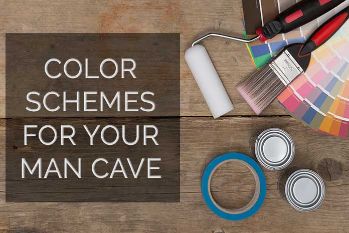
There are many kinds of man cave trends. And picking the right colors can help you achieve a certain mood or ambiance apart from making it chic and authentic. Check out the top 5 man cave color schemes for 2022 that you may want to consider when revamping your cave this year.
Why use a Color Scheme for your Man Cave?
Man caves often use dark colors like black, grey, or brown. But who said that you cant use a splash of colors, bright serenity, or wash of light colors for your man cave? Color schemes are an excellent way of expressing your personality.
While choosing your man cave color theme, using a color scheme allows you to pick a perfect blend that allows you to bring the ambiance desired without ruining the aesthetic appeal.
Color schemes help you bring in authenticity and elegance, allowing you and your buddies to relax and relieve your minds from work stresses.
5 Color Schemes to Consider for your Man Cave
While most current man caves are designed for an older crowd, the man cave is evolving to appeal to a younger audience. Man caves are now less about watching football and more about hanging out with friends, playing video games, and enjoying a beer. The next generation of man caves will be designed to be more comfortable and more inviting to guests.
That’s why the 2021 trends for man caves are incorporating the liveliest color schemes to ensure they meet everyone’s taste and preference. Color schemes are made up of a series of colors to enhance the aesthetic appeal to the eyes of man cave dwellers.
Some of the color schemes worth considering include:
- Bold and Masculine: A bold and masculine color scheme can be achieved by using dark colors like navy blue, forest green, or deep burgundy. Accent with metal or leather accents to complete the look.
- Rustic: A rustic man cave can be achieved by using natural colors like brown, beige, or gray. Use wood accents, such as wooden shelves or a wooden bar, to complete the look.
- Sports Themed: A sports-themed man cave can be decorated using the colors of your favorite sports team. Use team colors for the walls and accent with team merchandise, such as posters, pennants, and flags.
- Industrial: An industrial man cave can be achieved by using a color palette of black, gray, and metal. Use metal accents, such as a metal bar or metal shelving, to complete the look.
- Retro: A retro man cave can be decorated using bold colors, such as bright orange, yellow, or green. Use vintage accents, such as a vintage bar or vintage posters, to complete the look.
It’s modern, edgy, and classic, allowing you to set any mod. If you want a soothing ambiance, go for the warmer shade like “greige” zone grey.
Choosing Colors That Blend Well Together
To create a great-looking man cave, you should choose colors that blend. Colors go well together when they are complementary colors. A complementary color is a color that is opposite another color on the color wheel. These colors are better when put together than when used separately.
Examples of a great color-complementary pallet are blue and yellow, orange and green, green and brown, and red and blue.
You color-complement when you combine any two colors on your color wheel and create a third color. You can have one complementary color and one contrast color. You can have one contrasting or complementary color and one accent color. Use the colors on either side to help you decide on the colors you want to create.
Think about how you light your rooms. Successful color comparison adds a third color in the room where you want the effect. This is crucial in setting the tone for your entire man cave space. Examples of a good color complement include green in a bedroom, white in an office, blue in a den, and blue and green in a living room.
Logical colors combine with negative colors perfectly. Some of the logical-negative color combinations include red and blue, black and white, and dark orange and purple. There are also logical colors that complement each other. These colors are blue and green, red and orange, yellow and brown, and green and pink.
Negative colors provide contrast or contrast against positive colors. Examples of logical negatives include red and white, orange and blue.
Applications of logical colors in interior decor are bleach and yellow. When you combine the colors black and yellow, you get a space that is serious, moody, or simplistic.
What makes a Color Scheme?
When it comes to creating a good color scheme, the best rule is to use a color wheel. A color wheel shows you which colors are complementary to each other and which ones clash. For example, red and green are complementary colors, which means they work well together.
Blue and orange are complementary colors, so they also work well together. Yellow and green would be unideal color pairs because they are too contrasting. You want to start small with your primary colors and see which ones you like. Then add any secondary colors that would work well together.
- The 5 Primary Colors
This is the general rule of thumb to start your color wheel: These five are the foundation of every color scheme. These include red, yellow, orange, blue, and green.
- The Secondary Colors
In addition to these five primary colors, you should also consider the secondary colors. These are blends of colors made by mixing two of the primary colors. On a color wheel, they’re usually located between the primary colors.
We use each one of the secondary colors in man caves to create a little bit of chaos in the rooms. These colors create contrast while still creating a defined space.
- Sticky Colors
Sticky colors can be used for all sorts of interior decorating tasks. The color will stay the same, but you need a little help getting the focus of the room. Some examples include yellow wall paint, tile, mirrors, and flooring.
- Practical Color Combinations
The second most important part of designing your man cave is using practical color combinations to create a balance between bright, friendly colors and neutral, classic shades. Red, yellow, orange, and white all work well together. Neutral shades like gray, beige, and cream are the perfect counterbalance to any element you add, such as potted plants and colorful wall art.
Final Thoughts
There are a lot of things you can use to make your man cave attractive and relaxing. You could use flooring and fixtures, artwork that goes with the walls, dishes, and collection containers. But by far the most important part of your man cave decor is the color scheme that you choose. This is where renovations can pay off.
Color is thought of as a visual cue, which means if you want people to quickly and easily understand what’s going on, you need to make the color scheme clear. That’s why you should plan for the most important sections of your man cave – the gaming section, bar, and chill spot. It’s also important to figure out the general mood you want your man cave to convey.